Uska, Lernia
Positioning / Identity
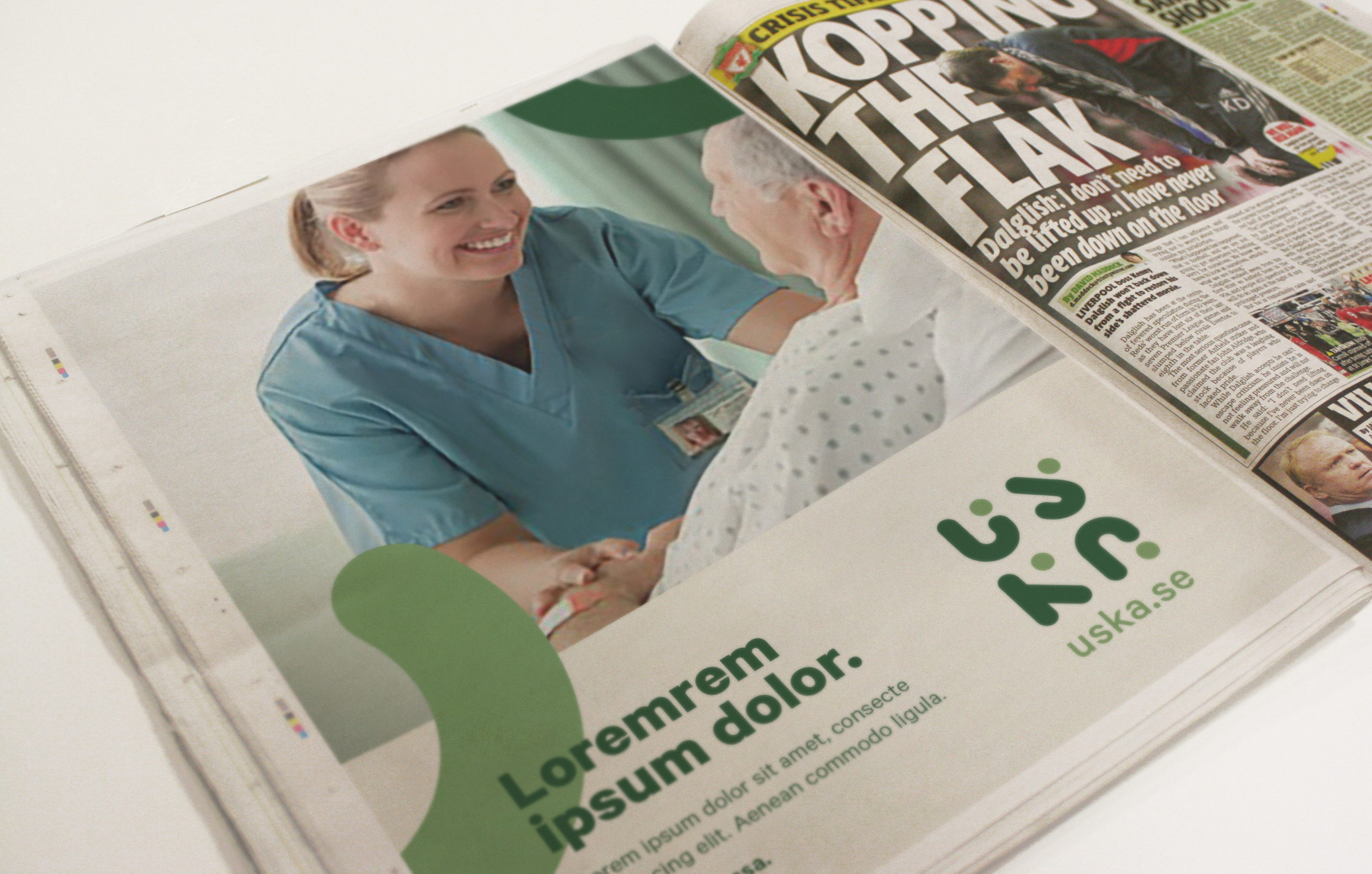
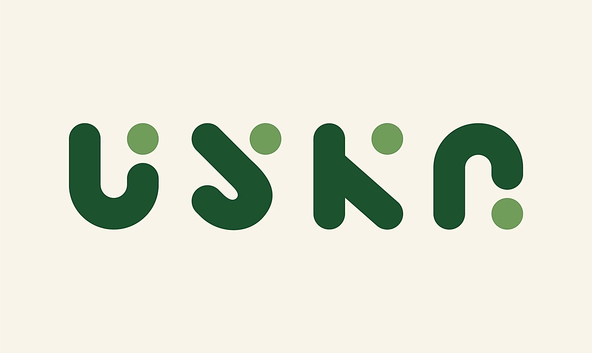
Uska is a digital job-matching service connecting care providers with the right opportunities in Sweden, backed by Lernia, one of the country's largest education and staffing organisations. With a brand still taking shape, we had the opportunity to start from a blank page, defining what Uska could stand for and building an identity around it.

Finding the why
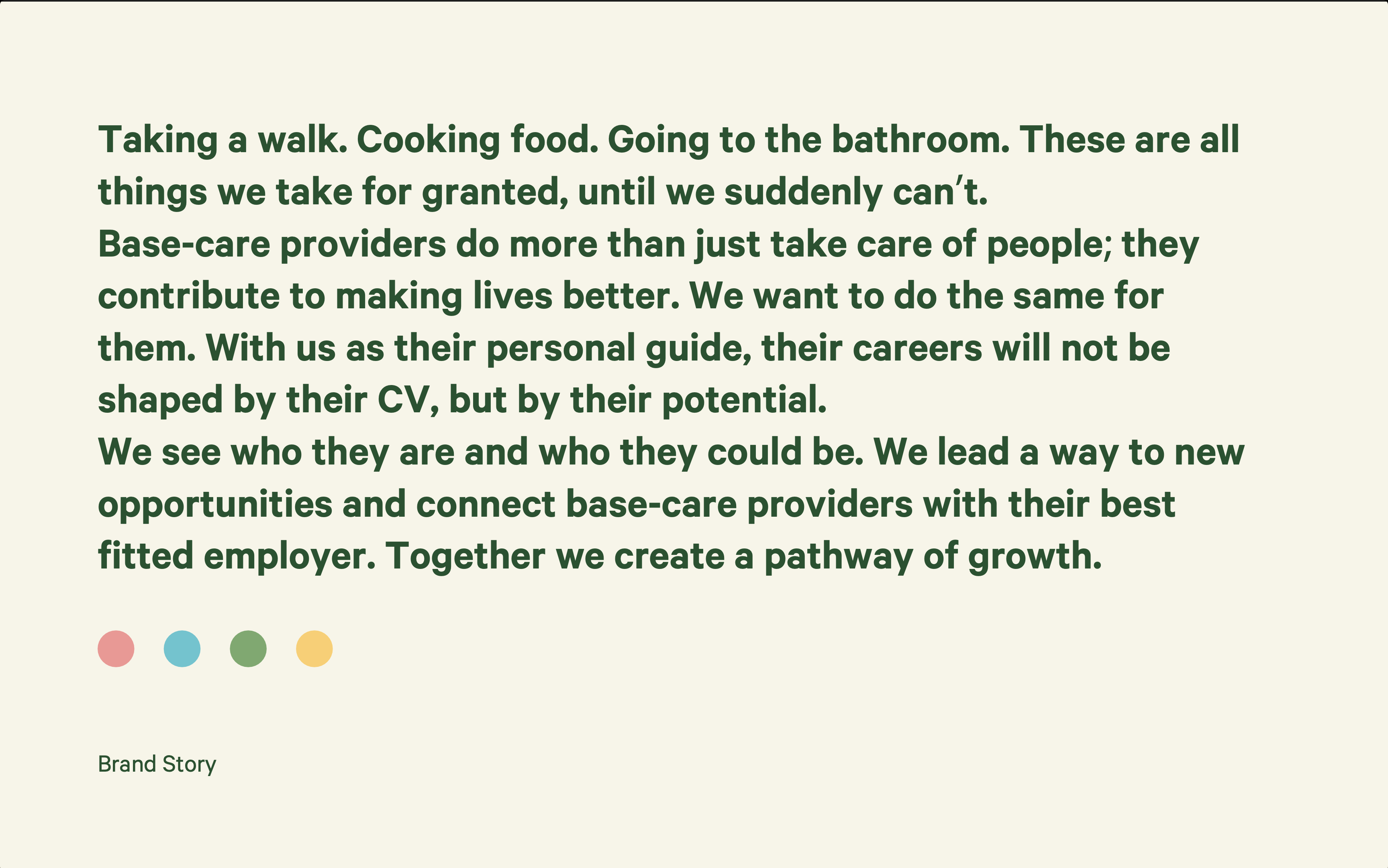
The brief was simple: Uska had a name and a product, but needed a story and an identity. The what was clear. Our job was to define the why and how, and build the brand from there.
Built around people
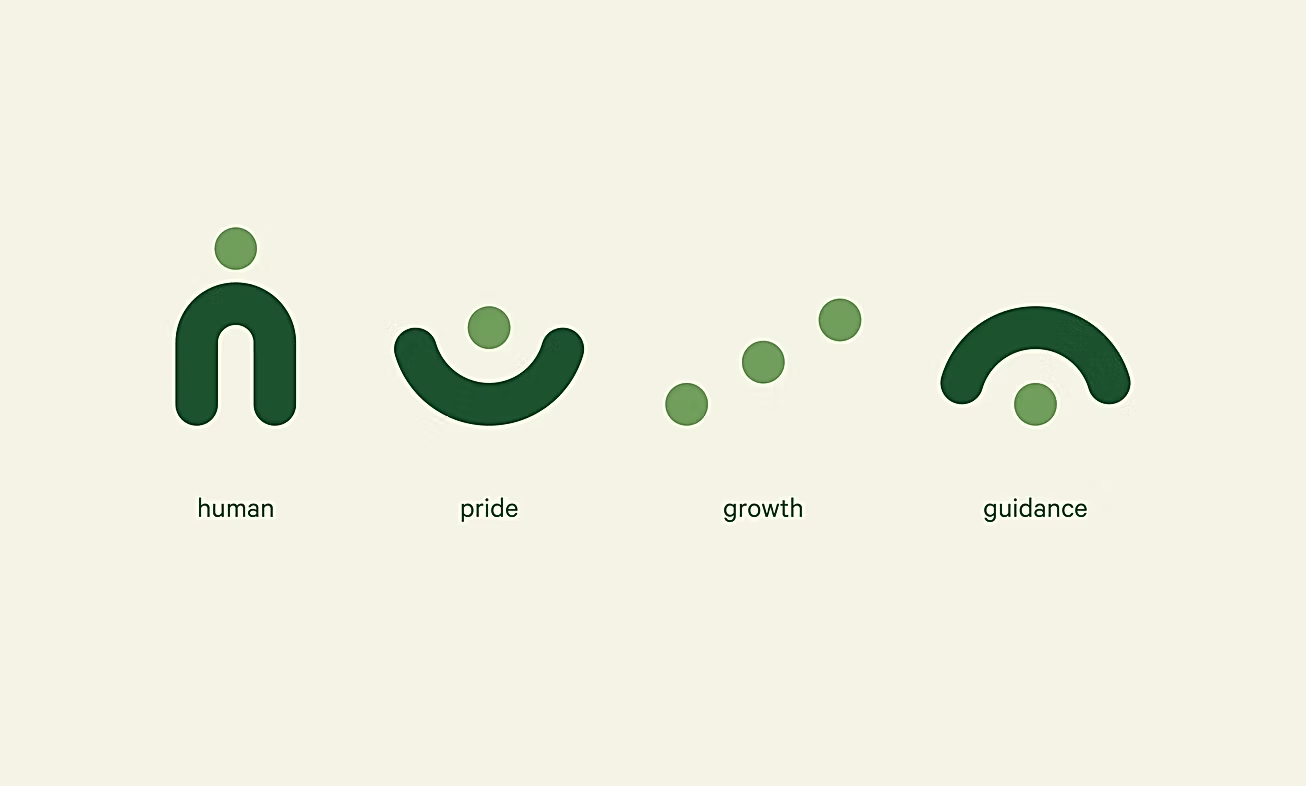
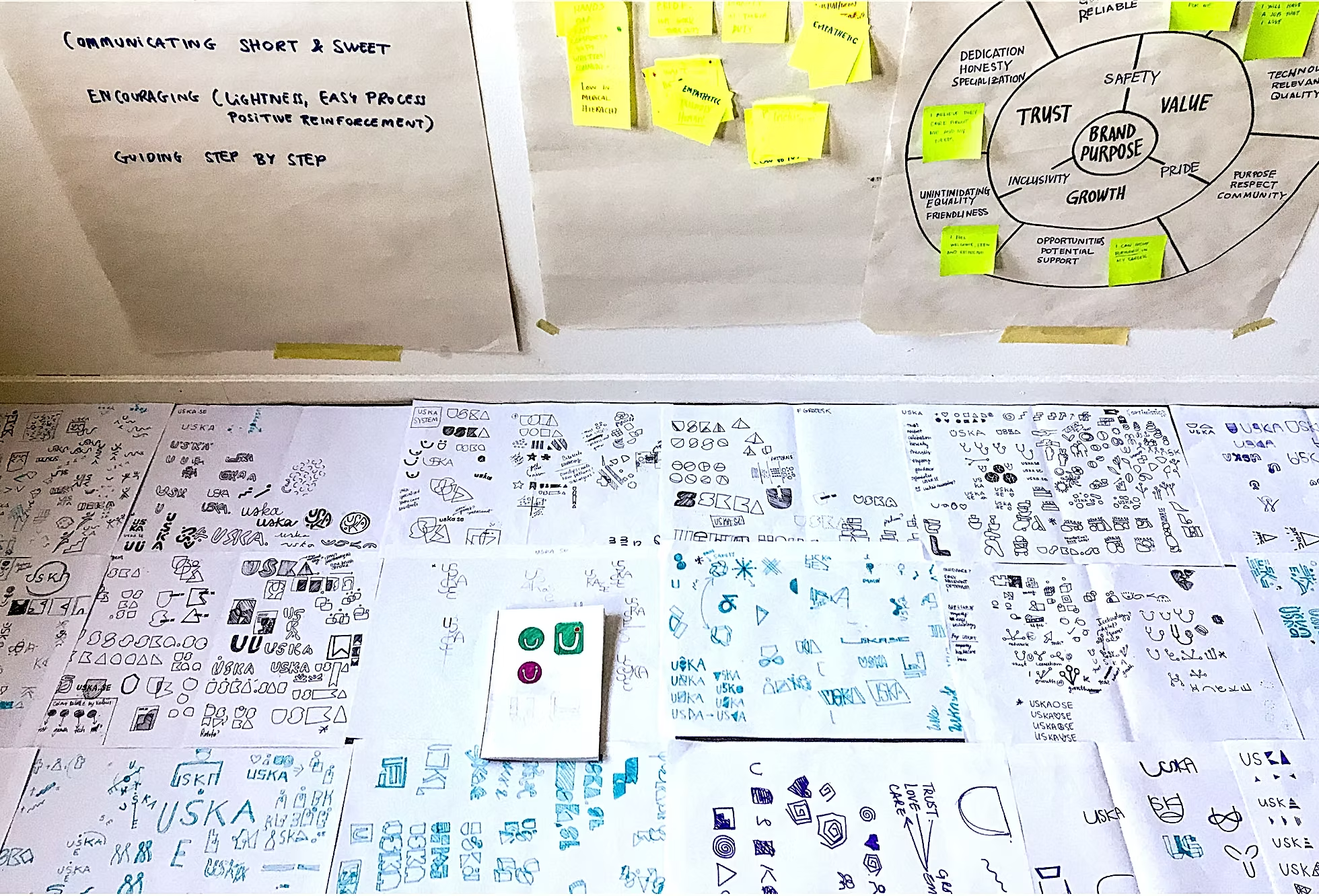
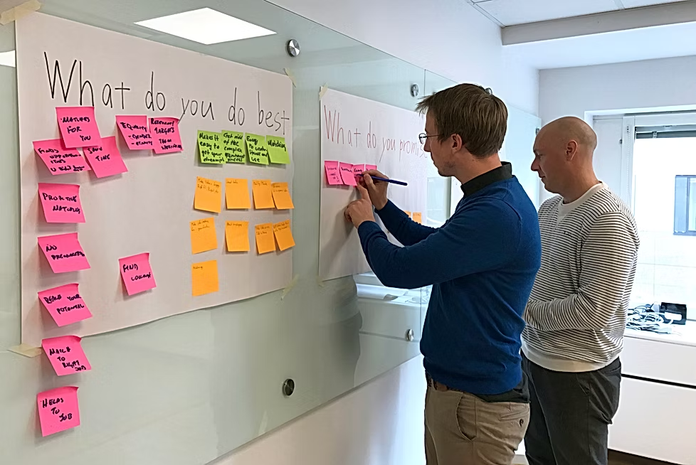
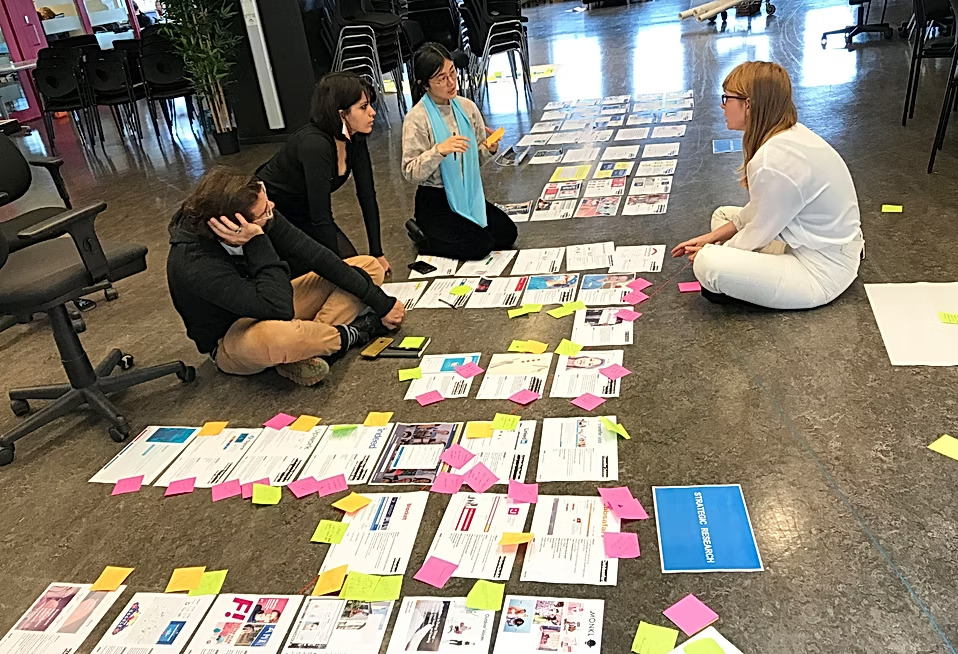
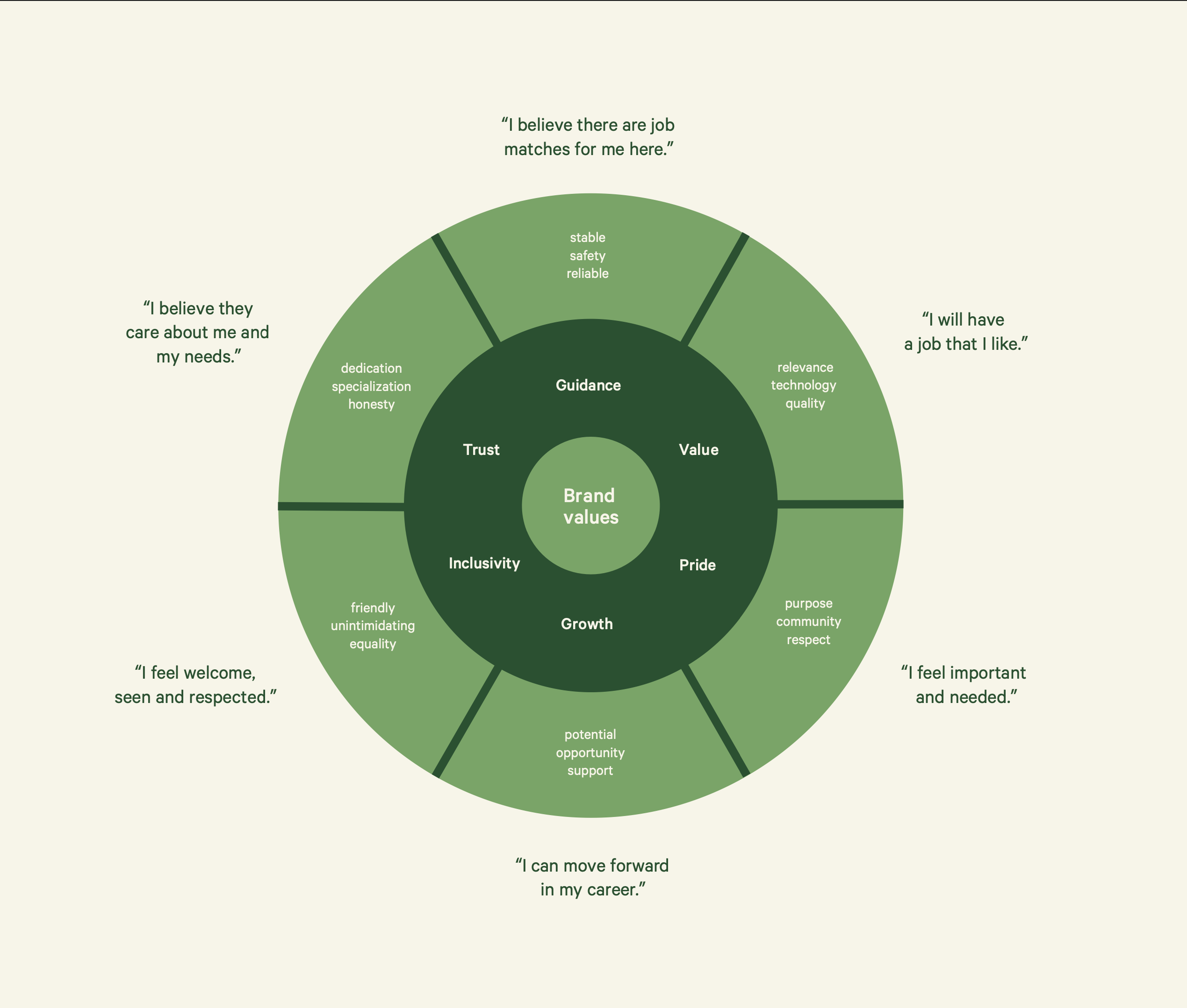
Through brand workshops, research and interviews with care providers across Sweden, we uncovered the needs and stories that mattered most. These insights shaped a set of brand values rooted in pride, trust, growth and recognition.
Celebrating Care
From this came Uska's brand purpose: to celebrate the work of care providers and support their potential — creating a brand that made the people behind care feel seen, valued and proud of what they do.